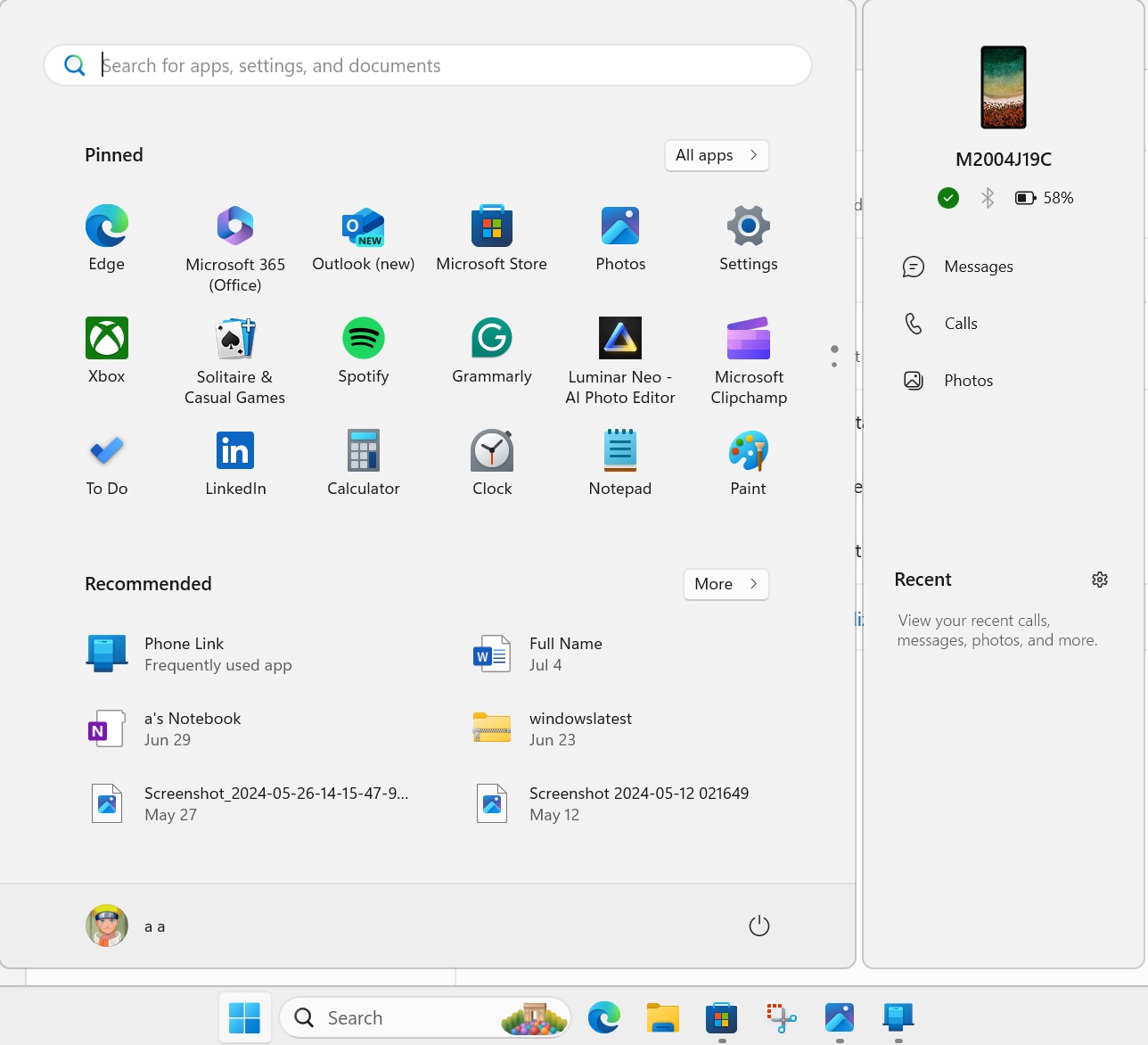
Windows 11’s Start menu recently got the most surprising feature called “Companions”. The feature added a floating panel to the right side of the Start menu, allowing you to quickly glance at Phone details. But this is just the beginning.
The Phone Link companion panel uses a feature called “Adaptive cards”. You might have spotted them while using a Microsoft app. Adaptive cards use JSON instead of HTML and CSS to display information.

Developers prefer Adaptive cards because they share the host UI and blend in easily, making them fit for displaying information.
Microsoft researcher Albacore found references to the Companion feature in the Start menu before it rolled out. He also shared a simple mockup of how you can build a Start menu companion for an app using adaptive cards on GitHub.
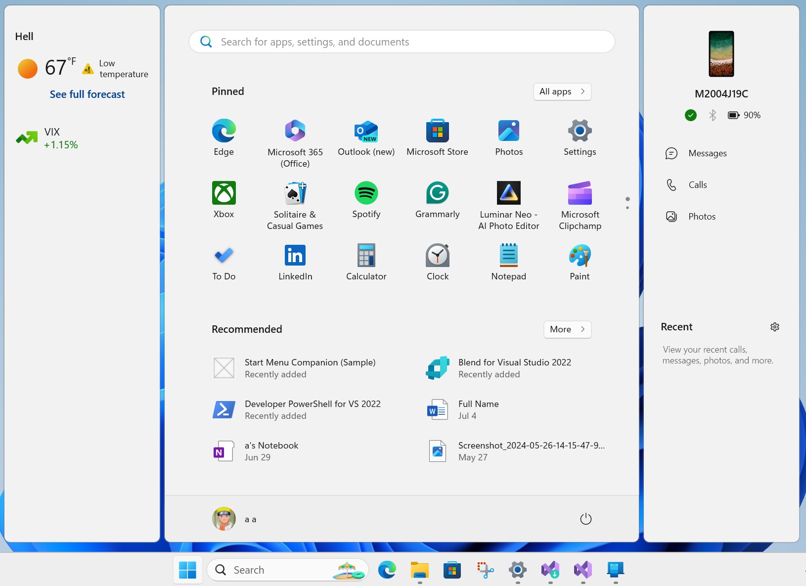
Windows Latest tried running the Start menu companion mockup and was successful in our tests. The panel appears on the left side and displays weather and market information. Clicking on it redirects to the MSN weather page.

Developers can create Companions for their apps and position them to one side of the Start menu. Note that only two Companions can appear on either side of the Start menu.
Like the Phone Link app, Microsoft could also offer companions for native apps or frequently-used apps like Teams, WhatsApp, Outlook, etc. So, you could quickly glance at messages or emails from your team.
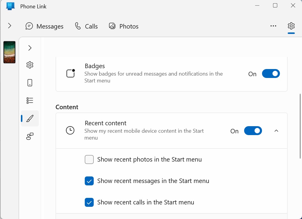
The Companion is also customizable. You can select which elements are displayed on the panel and choose to hide the ones you don’t need. For example, you can select if recent calls or messages appear in the Phone Link’s panel or not.

It’s likely more companies and developers will begin bringing their own Companions to the Start menu, and you’ll be able to fully customize the experience.
However, this isn’t the only change arriving in the Start menu.
Layout experiments in the Start menu
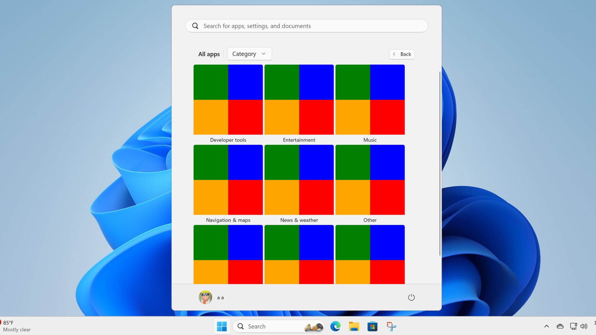
Microsoft is experimenting with the layout of the All apps section in the Start menu. Previously, a grid layout option appeared in the Start menu which makes it easier to navigate through the long list of installed apps.
Now, a grouped option is also in the works which will display icons in categories. Both these layouts will improve the way you find and navigate the apps in the Start menu.

We expect Microsoft to allow users to set a default layout option, so you don’t need to change it every time.
The post Hands on: Microsoft is reimagining Windows 11 Start menu with Adaptive Cards appeared first on Windows Latest
