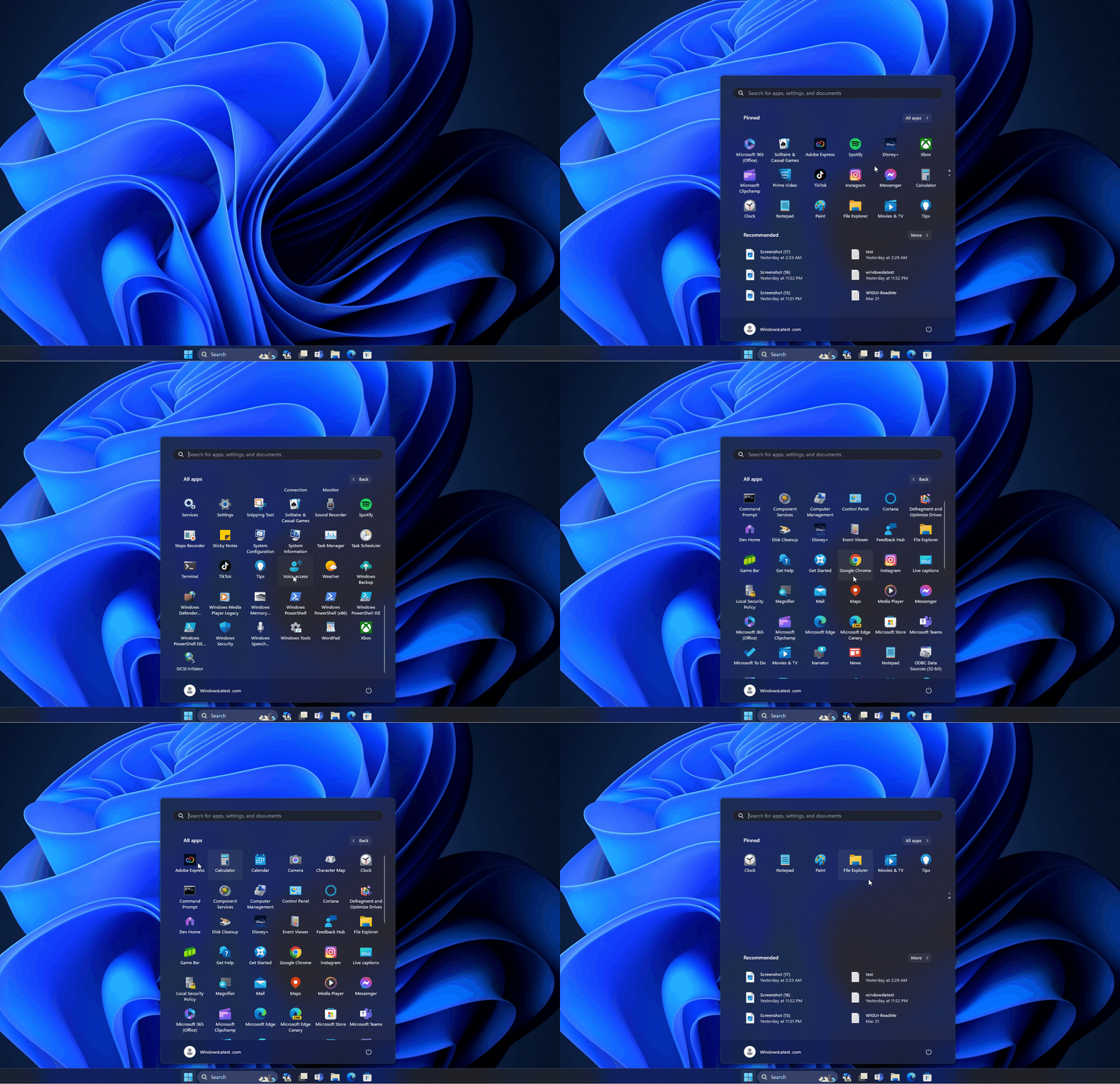
Microsoft is testing a new design for the Windows 11 Start menu that displays apps under “All apps” in a grid layout rather than a vertical layout organized alphabetically. This new design is similar to Windows 10X’s Start menu.
With Windows 11, Microsoft dropped live tiles for icons, as the company wanted the Start menu to be simple. In the stable builds, when you click on “All apps,” you see a list of all the installed apps, organized alphabetically, making it easier to find the app you’re looking for.
The current Start menu’s All Apps layout is a vertical list of apps, but Microsoft wants to change it to a grid of icons. As PhantomOcean spotted, Microsoft is testing a new design for the Windows 11 Start menu with a grid layout for the “All apps” list, and we were able to test it in the beta builds.

In our tests, we observed that apps are shown in icons arranged side by side and on top of each other to form a grid.
The good side of this grid layout is that it looks clean and organized and can make better use of space on the screen. This means you can see more apps at once without having to scroll.
It can also be quicker to find the app you want because the icons are bigger and easier to spot.
However, there could be some downsides. If you have a lot of apps installed, the screen might look crowded or too busy. Some people might find it harder to read the app names if there’s a lot going on visually. And, because the apps are arranged in a grid, if you’re used to a list, it might take some time to get used to this new way of finding your apps.
At the moment, we don’t know if the company will offer a toggle to switch between the layouts as it does in Microsoft Launcher for Android.
The endless cycle of Windows releases means that some people will like the change, and some will dislike it.
Do you like the new Start menu design? Let us know in the comments below.
The post Microsoft tests a new grid design for Windows 11 Start menu’s All apps appeared first on Windows Latest
