Vertical tabs have been a feature in Edge for quite some time. It lets you move the tab bar to the left side in a vertical orientation. I don’t use it most of the time, but it must have a niche following because Microsoft hasn’t scrapped it. Instead, it’s experimenting with a new layout scheme for the feature.
Browser researcher Leopeva64 spotted this hidden change in an experimental Edge build a month back. Now, a flag related to the feature is available in the Canary version of the browser, which adds a lot of experimental features with every build.
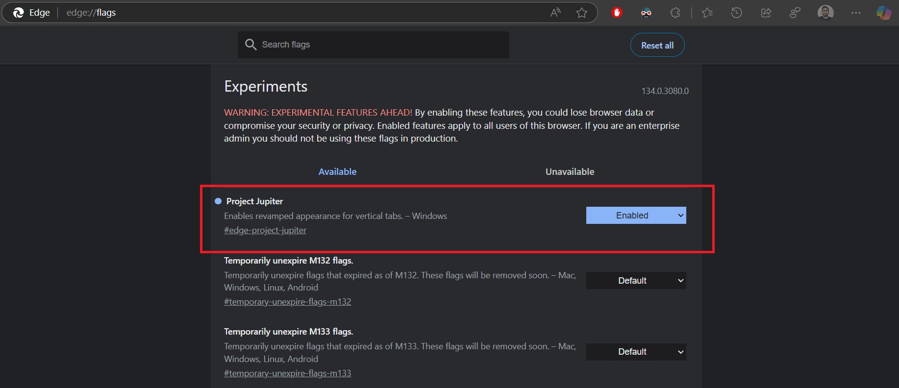
Windows Latest updated the Canary version of Edge to the latest build and then found a flag related to the vertical tabs feature. The flag name is “Project Jupiter,” which bears the “Enables revamped appearance for vertical tabs” description with the #edge-project-jupiter ID.

Going by the description, we understand that it’s mostly cosmetic changes related to the feature. We enabled the flag and rebooted the browser to compare it with the stable version’s layout.
What’s changed in Vertical Tabs?
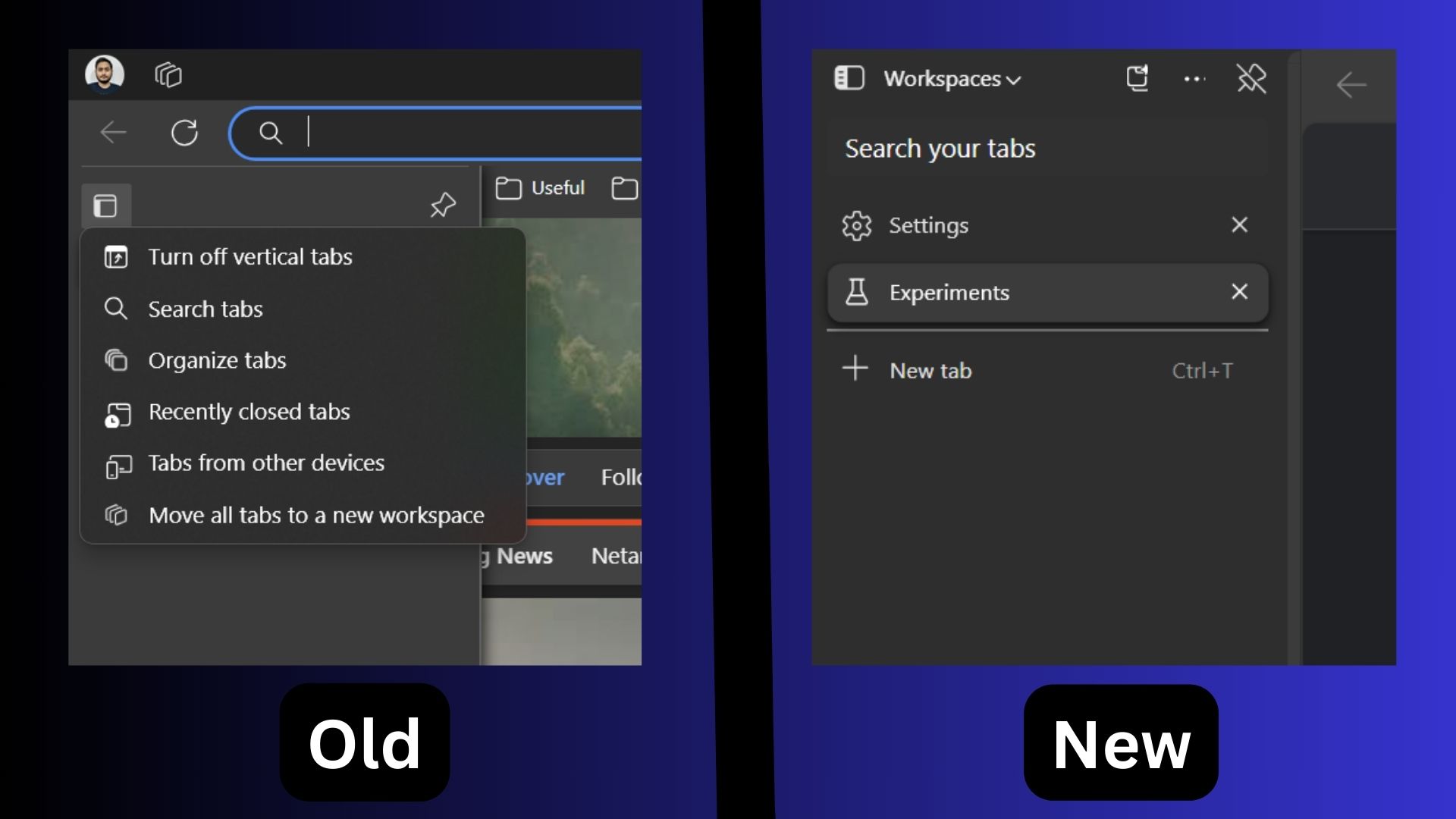
The first thing that stands out is that the vertical tab bar is now a separate section. In the old version, it appeared below the ULR bar, but now it’s in a separate container and looks distinctive. The difference is visible when you use it in maximized mode, and it looks like a completely different part of the browser.
Until now, any new feature addition has always lived inside the main browser window, but that’s not the case with this one. Also, the Tab Actions button is gone now, and your Profile icon appears next to the More Settings button in the URL bar, next to the Copilot icon.

Another noticeable change is the addition of the Search tabs feature at the top of the layout. In the stable version, you had to click the Tab actions button and then select the Search tabs feature, which would open a floating window in the center of the browser.
The other options that appeared in the Tab actions menu are moved to the three dots (…) button. Some options appear in the right-click context menu for the vertical tabs.
All the Workspaces-related options are now tucked inside the Workspaces button and there’s a new button to organize the tabs too.
If we compare it with the stable channel’s layout, the new Project Jupiter layout is easier to use. You get all the options presented concisely rather than displaying an overflowing context menu or opening some features in the browser’s main area. All activity happens inside the new layout, and when the feature rolls out, you’ll appreciate the thought.
You’ll be able to try the Vertical tabs experience in Edge for Windows 11 soon, but wouldn’t it be nice if the feature had a more modern touch, such as Fluent Design or Mica? Hopefully, we’ll see more modern cosmetics changes because we recently spotted flags related to Edge’s cancelled Project Phoenix.
The post Microsoft Edge is redesigning Vertical tabs on Windows 11, and it looks really nice appeared first on Windows Latest
