Copilot is getting a whole new look with voice mode, and it will begin rolling out to some users in the coming weeks. The new Copilot is faster and better than ever and on par with ChatGPT to some extent.
Microsoft is testing a “card-based” Copilot, and we’ve managed to turn on the new web-based redesign. Unlike the original Copilot UI, this new version is sleek and on par with ChatGPT when it comes to web performance. We also noticed that Copilot’s answers are now faster and as good as those on ChatGPT. It’s a significant update.
Since Bing hero Mikhail Parakhin left Microsoft, Copilot for consumers has appeared to be on the “back burner”. Copilot has been offering a “downgraded” experience, and there’s simply no reason to use it over ChatGPT unless you’re specifically looking for Bing’s factually checked answers.
Over the past few months, Microsoft has removed PDF File uploads and three modes in some regions, locked down people to 30 prompts, and failed to offer “ChatGPT-4” at its full potential. There’s also no word on the GPT-4o (mini) or the new GPT-o, and there are some concerns that the Copilot still relies on GPT 3.5 or some in-house model.
Copilot Pro for consumers also dropped the “Custom GPTs” feature, which is still offered with ChatGPT Plus.
More importantly, Copilot for the web has never been as smooth as ChatGPT or even Gemini. This is one of the most common complaints. The Copilot mobile app is also extremely slow and offers potato performance even if you subscribe to Copilot Pro.
Copilot is currently worse than the initial release, but it’s about to get a big makeover.
This is the new Copilot with card-based UI, faster performance, and modern design
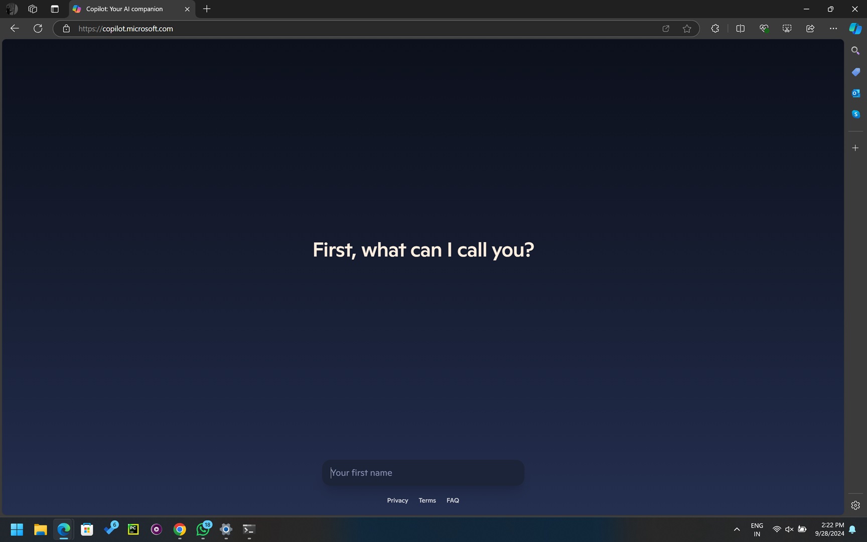
As soon as you open Copilot v2, it will ask for your name to personalize the experience. Then, you can sign in to your Microsoft account. Remember you can still use Copilot without signing up for a Microsoft account
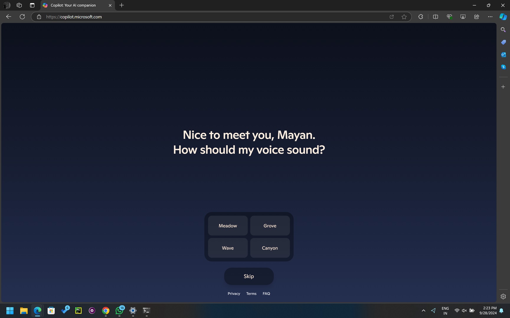
Once you’re logged or you’ve entered your name, you’ll notice a clean layout. You’ll be asked to choose Copilot’s voice mode. There are four options to choose from, but more voices will be added in the coming months. Windows Latest understands that Microsoft’s Copilot will offer “voices”, which are different than those available on ChatGPT.
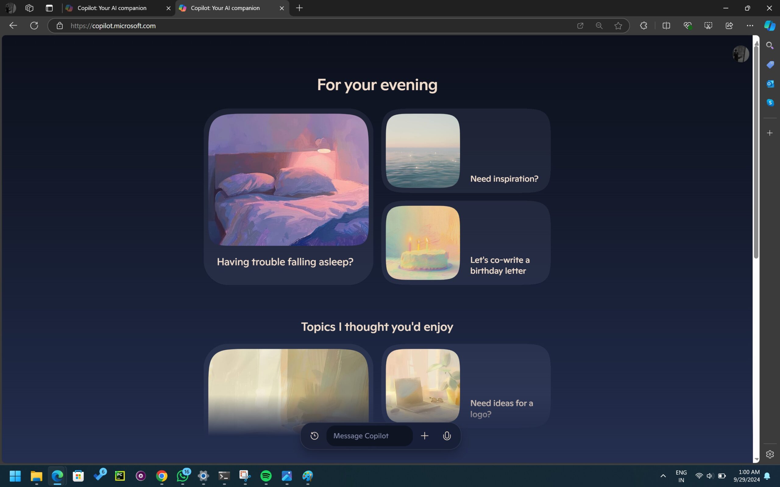
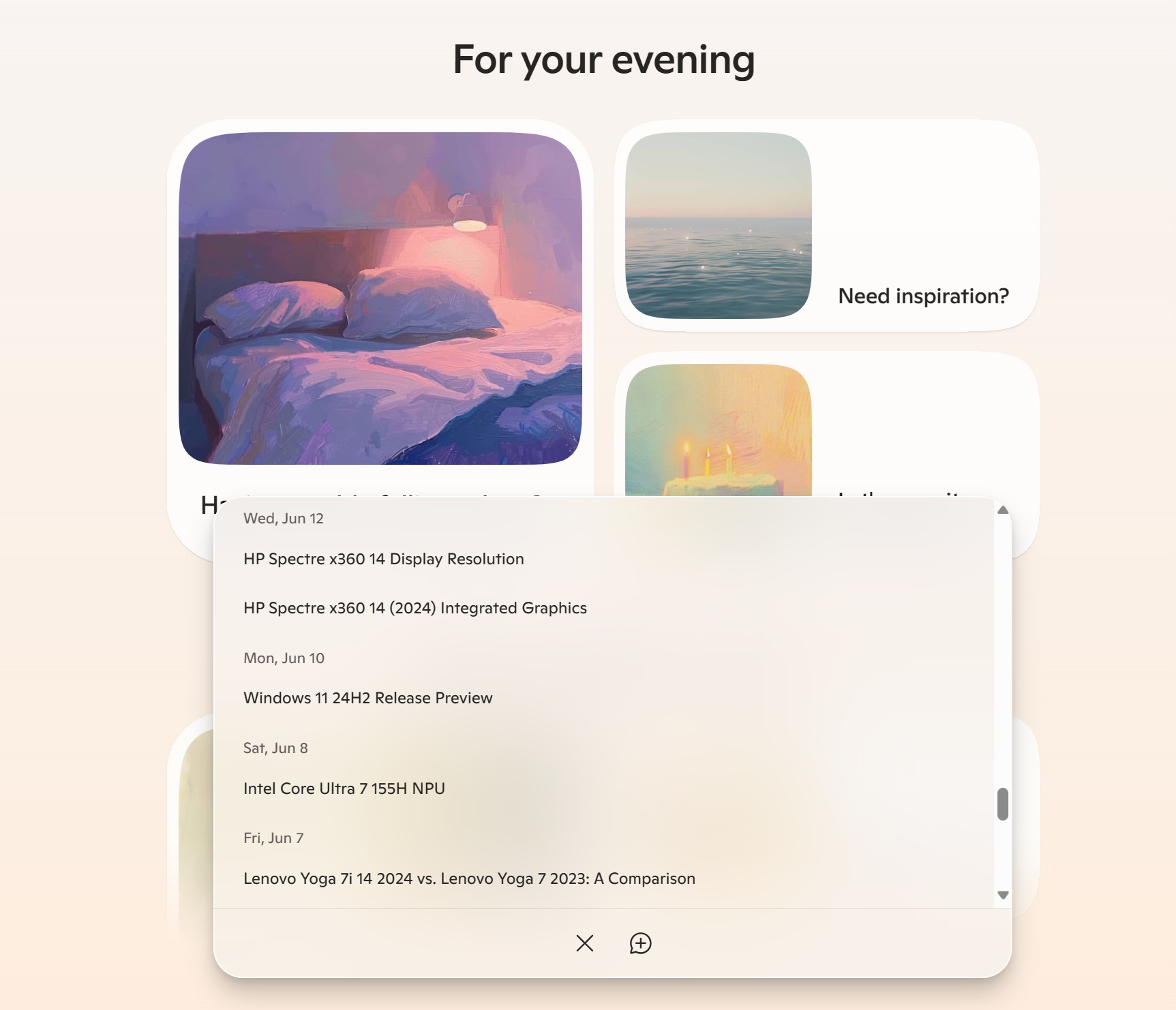
As I mentioned above, it’s a card based design.
One of the first things you notice is a new homepage, which is organized in rounded cards, each encouraging you to just use the card and explore generative AI.
For example, you might see one that asks if you’re having trouble falling asleep. You can scroll down to explore other “cards”. These cards are more like suggestions.
As you might have noticed in these screenshots, the colours have been changed.
You’ll get two new themes called “Day” and “Night”. In Day mode, the background is light and soft, with pastel colors. Night mode switches to a darker, more subdued look.
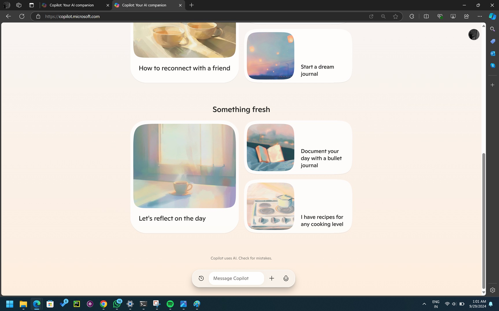
At the bottom of the screen, there’s a “Message Copilot” bar that allows you to start typing right away. Also, the interface has an “infinite” scroll, so you can scroll through the previous history or click the “history” button at the bottom.
It has a fluent material design and an acrylic touch.
And in dark mode:
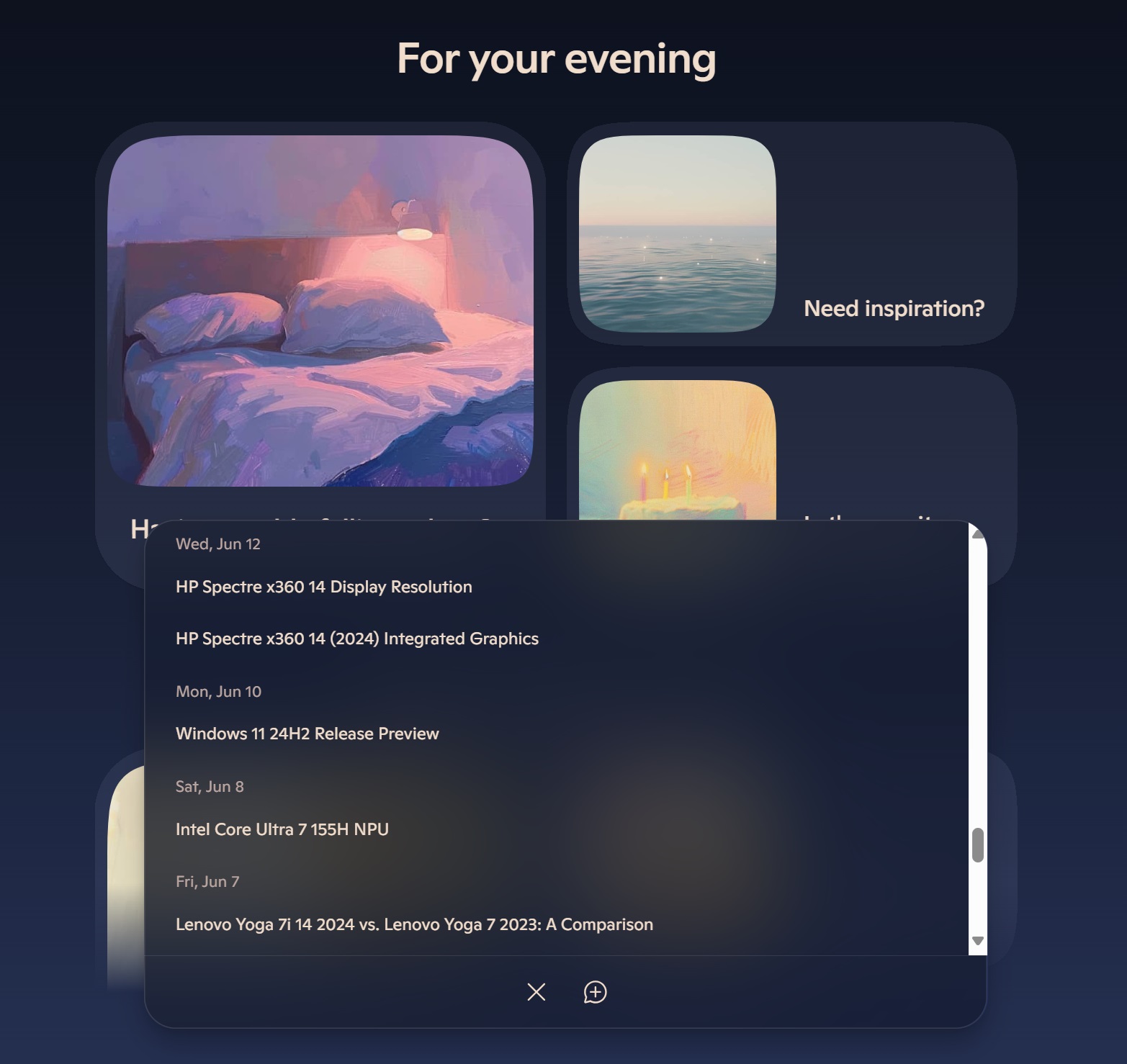
The bottom bar is always visible, so no matter where you are on the page, you can quickly ask Copilot.
Here’s how the conversations with Copilot now look like.
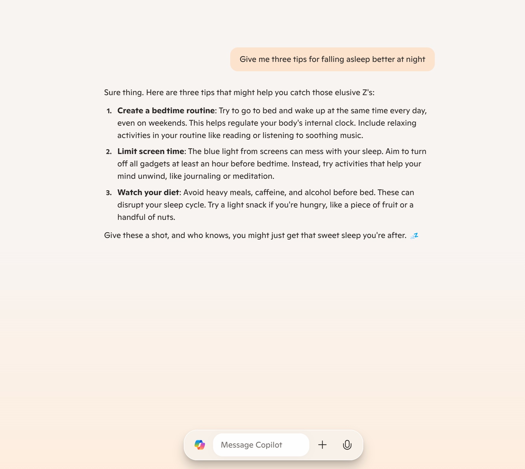
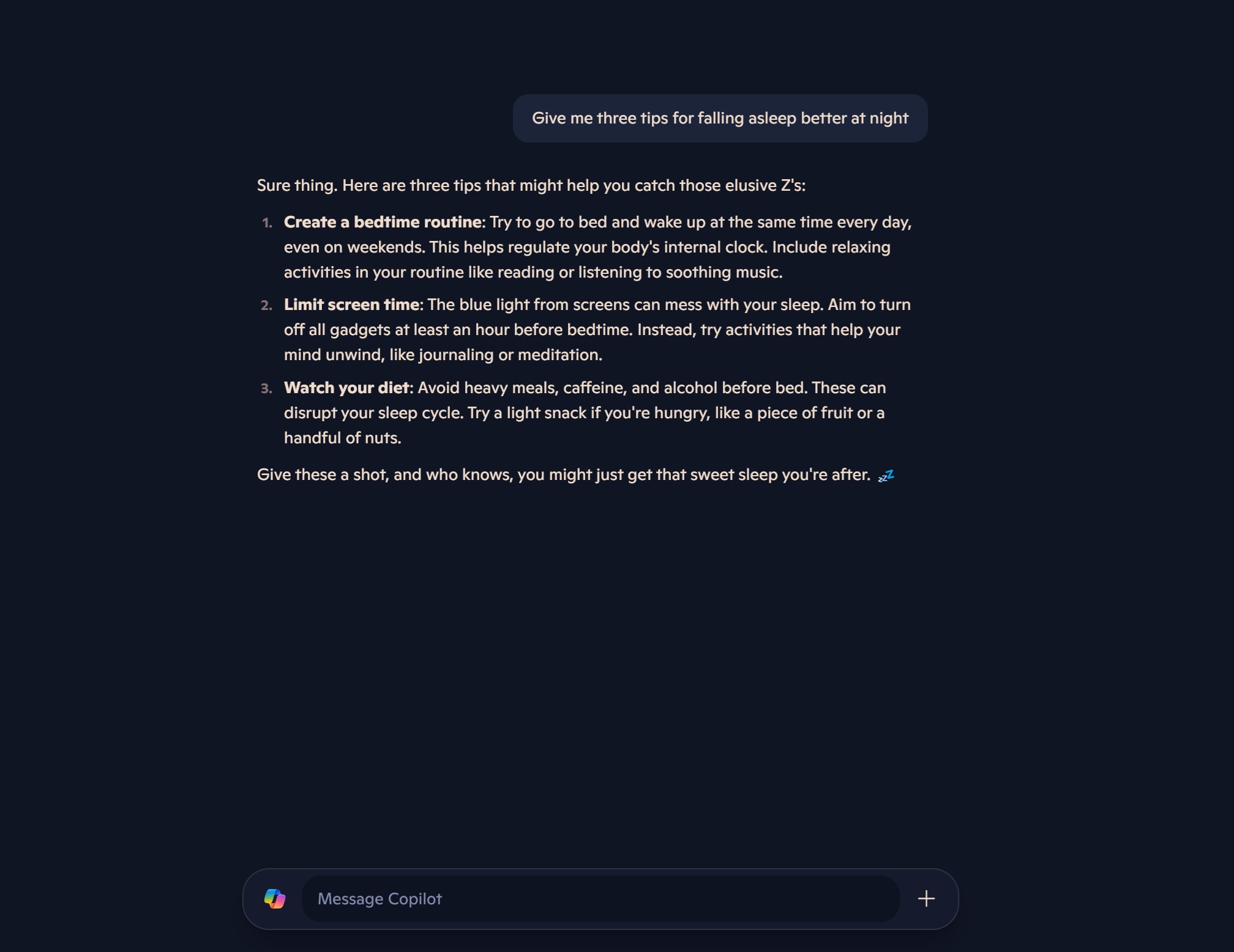
There’s a new voice mode and it’s similar to the one offered on ChatGPT Plus, but it doesn’t seem to be working for me at the moment.
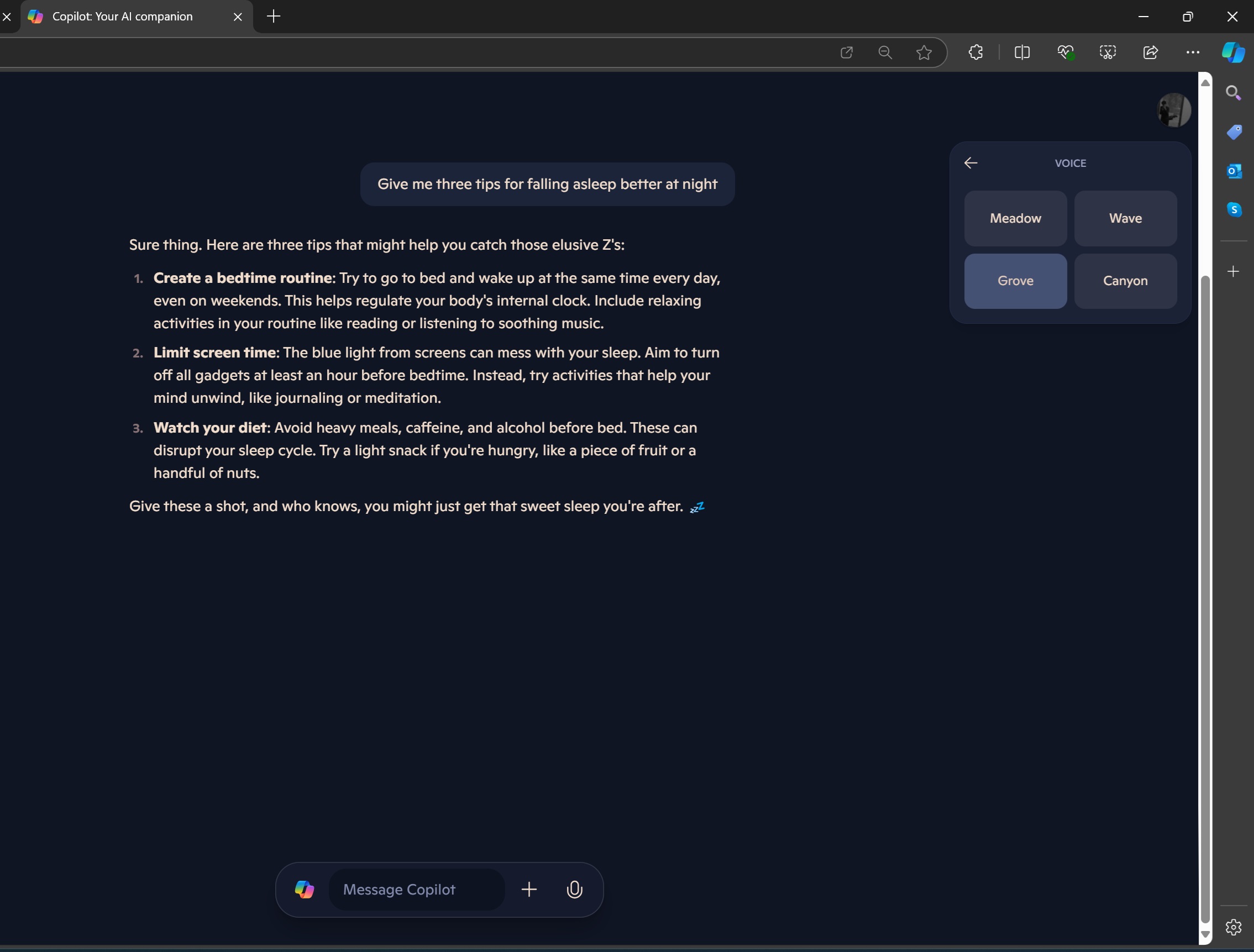
As shown in the above screenshot, Windows Latest spotted four voice models: Meadow, Wave, Grove, and Canyon. Each mode represent a unique “vibe” or tone, from more relaxed and calm to energetic or focused.
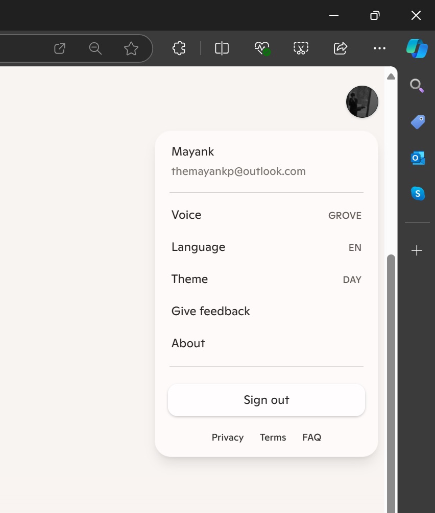
On the right side of the screen, there’s a handy menu that gives you access to different settings and options, such as your profile, language settings, theme choices (to switch between Day and Night modes), and a feedback section. It’s tucked away neatly, not taking up much space but still easy to spot when you need it.
I’m going to update this article with more screenshots and videos in the coming hours, so check back again.
The new Copilot redesign is really significant, and it has the potential to convince people (including myself) to start paying for Copilot Pro again.
Let me know what you think of the new Copilot in the comments below.
The post Hands on: This is Microsoft’s new Copilot and it competes head to head with ChatGPT appeared first on Windows Latest
