Similar to how an Android phone or an iPhone pushes you to use a Google or Apple account, respectively, Windows 11 has also become aggressive with its Microsoft account integration. More recently, Microsoft started rolling out a new design for the Start menu that integrates the Microsoft account manager, but people dislike it for a few reasons.
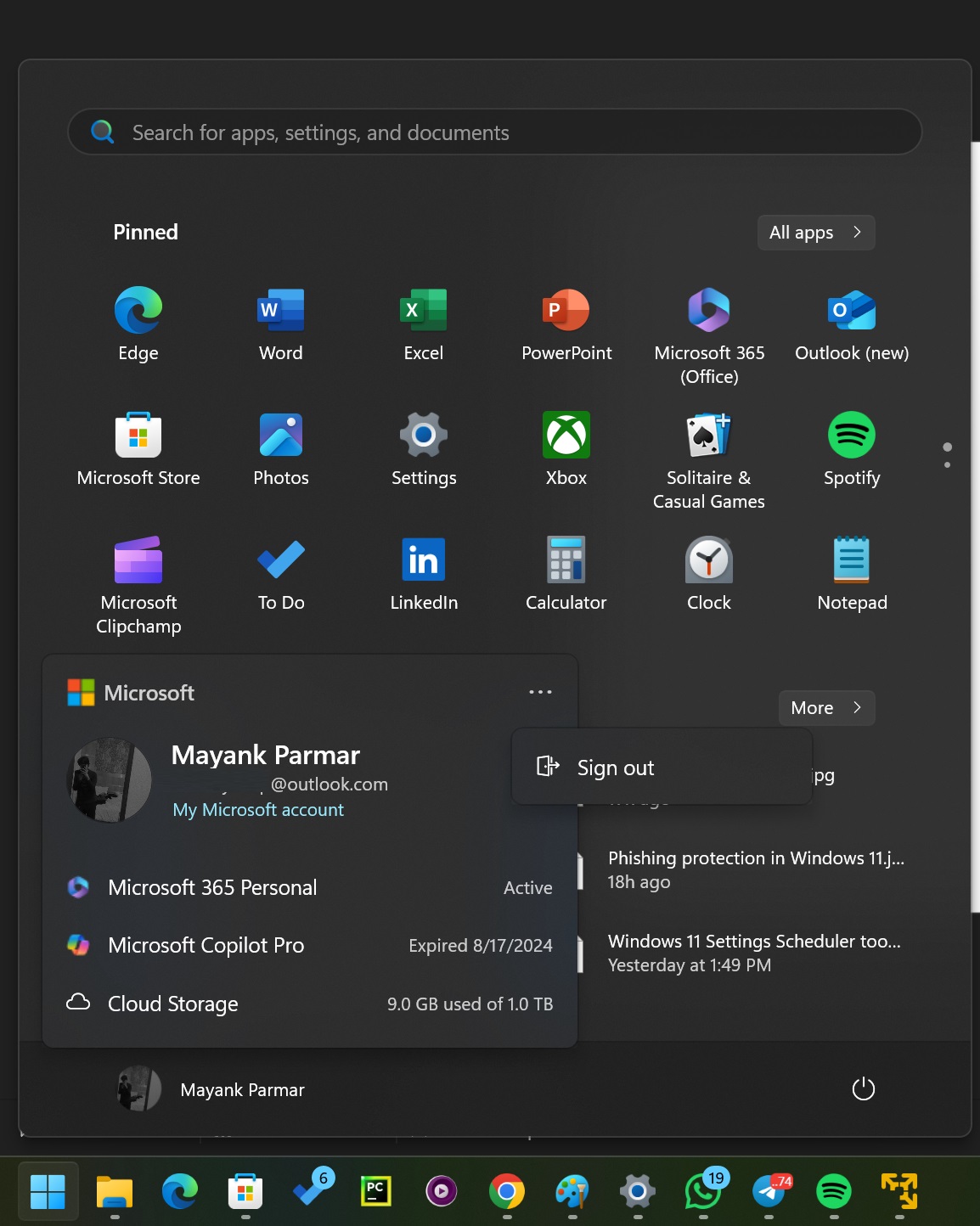
First and foremost, it hides the critical options like “Sign out” inside a new three-dot menu, and it takes about two additional clicks to reach there. While it may not be a big deal for everyone, some people hate the design choices Microsoft made here. If you haven’t updated to the most recent version, take a look at the new Microsoft account manager:

As shown in the above screenshot, the new Microsoft account manager in the Start menu highlights account-related information, such as active or expired subscriptions.
In my case, since I did not renew my Copilot Pro subscription, it’s mentioned as “expired.” It also highlighted my active Microsoft 365 personal plan alongside my OneDrive cloud usage.
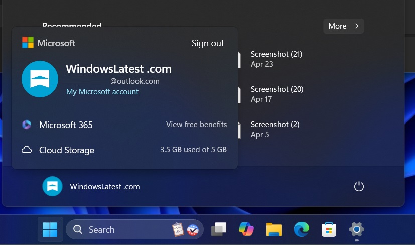
For comparison, here’s what the Start menu looked like before the September 2024 Patch Tuesday update. It was pretty simple and straightforward, with options like “Sign out” and “lock” clearly visible.

The Microsoft account integration has revamped the entire experience, and the opinion on the update is subjective. If you click the three dots, you can switch between logged-in accounts, sign out, and return to the lock screen.
In our tests, Windows Latest spotted a slightly improved version of Microsoft Account Manager that moves the “sign out” button outside the three dots menu.

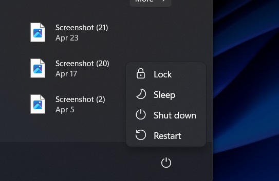
Also, the Lock option is now available via the power menu. You can still use the Windows + L keyboard shortcut to lock your device.

It is worth noting that you cannot revert these changes. It is not possible to remove the Microsoft account manager and switch back to the simple old look.

The account manager in the Start menu is here to stay, and it’s also interactive.
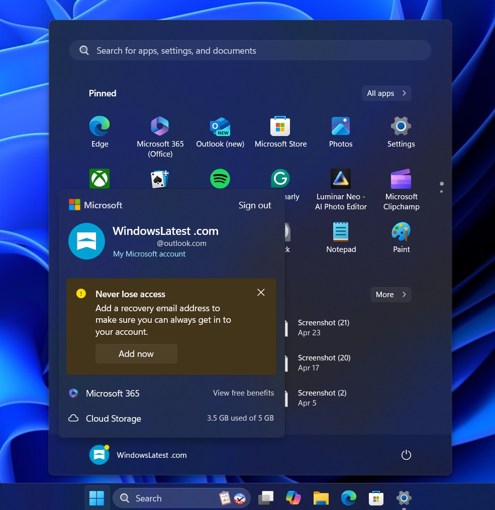
It may encourage you to update your recovery email or password and configure recovery options if you haven’t done so yet.
Windows 11’s Microsoft account manager is expanding

According to references in preview builds, Microsoft plans to bring the same account manager experience to Windows 10 in a surprising move.
While Windows 10 is supposed to be on the back burner, it’s still getting Windows 11-like Microsoft account manager within the Start menu whether you like it or not.
The post Windows 11 Start menu’s Microsoft 365 account manager is finally less annoying appeared first on Windows Latest
