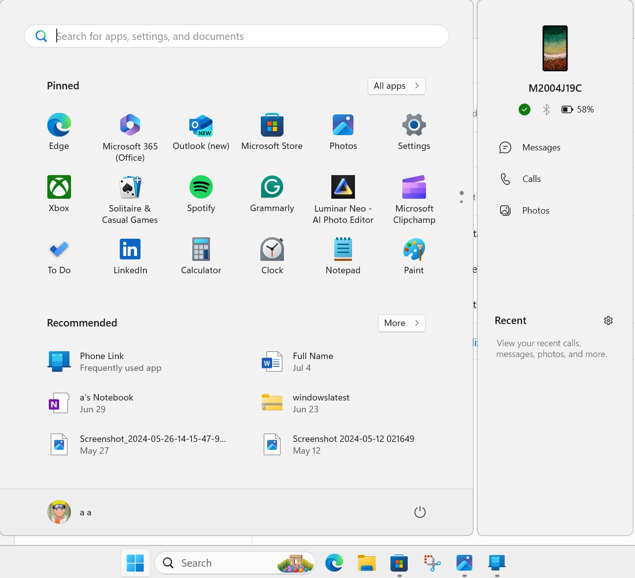
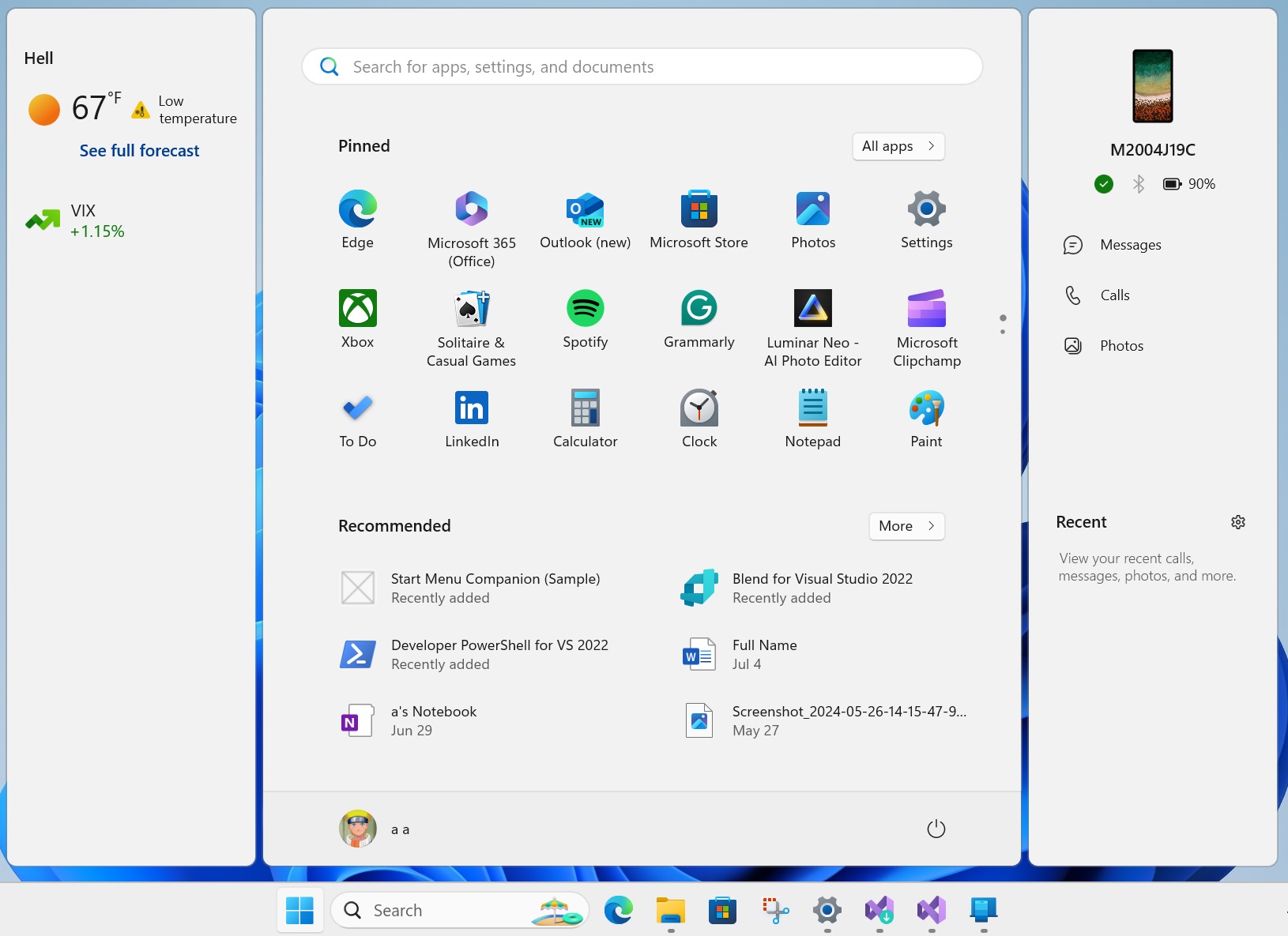
Windows 11’s Start menu is undergoing another big facelift, and it looks a lot like Windows 10 Live Tiles, but some people might find the new look cluttered. In recent preview builds, Microsoft started exploring ‘adaptive cards’ support for the Start menu, which could integrate widgets-like cards into the Start menu sidebar.
The current Start menu design in Windows 11 has several app icons under the “pinned” section. Then, we have recent app or file activities under the “Recommendation” section. Unlike Windows 10, the Start menu in Windows 11 is static. You cannot interact with what’s on your Start menu, but this could change in a future release.
Windows Latest has been reporting about Microsoft’s plans to integrate “adaptive cards” into the Start menu. The adaptive cards, which also power the Widgets board, will allow you to interact with certain Windows 11 features, such as “Phone Link”.

For example, you may be able to respond to a text message on your phone directly from the Start menu.
The sidebar will initially be limited to the Phone Link app, but Microsoft plans to open it to everyone because adaptive cards can be used by anyone.

According to the documentation, these adaptive cards are written in JSON and can be rendered natively to match the look and feel of Windows 11.
For example, if an adaptive card is created for widgets board, when the same payload is sent to Windows 11 Start menu, it will look and feel like the Phone Link integration on the sidebar.
You’ll find toggles related to these adaptive cards or companions in Settings > Personalization > Start. As mentioned, it’s limited to the Phone Link app for now, but I wouldn’t be surprised if Microsoft uses it as another opportunity to sneak in MSN-related content, such as MSN Weather.
That’s the first significant change you’ll notice in a future release of Windows 11 24H2.
Start menu with new app layouts

But is that all? Well, not really.
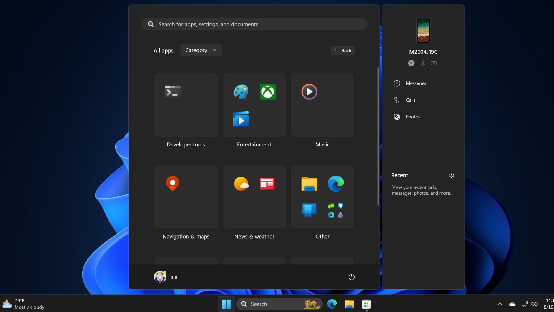
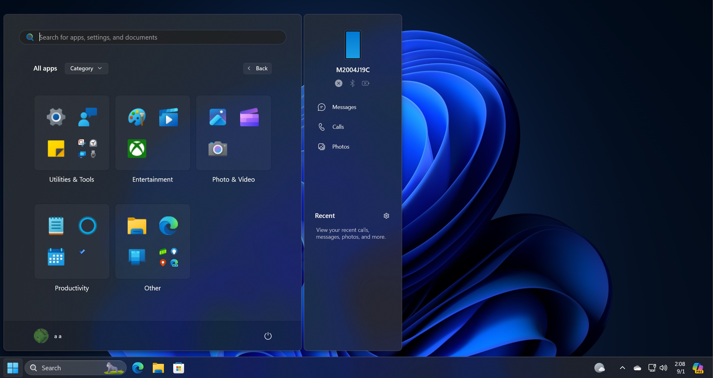
The Start menu’s all apps section is undergoing a significant overhaul, and it actually gives Windows 10 Start menu vibes, especially when you change the alignment to the left side of the screen.

As shown in the above screenshot, the Start menu’s All Apps section has a new “category view” that groups similar apps under the same category. Only app icons are shown and are similar to small live tiles grouped.
In this new layout, apps are grouped into categories like “Developer tools,” “Entertainment,” “Music,” “News & weather,” “Other,” and “Photo & video.”
Each category has icons representing different apps.
Finally, there’s a new user profile button at the bottom left corner that lets you view your Microsoft 365 usage and the “sign out” button is no longer hidden.
The post Windows 11’s new Start menu is shaping up well, but is it similar to Windows 10 live tiles? appeared first on Windows Latest
