Microsoft hasn’t budged down from experimenting with the Start menu. Be it the companion panel for apps next to the Start menu or layout experimentations, Windows 11 is trying to do it all. After testing a grid layout for the All apps section, we found that it wants to offer a category view as well.
Windows Latest previously covered the hidden “Category” layout in the All apps section. At that time, color appeared in the category blocks rather than apps. But, after the latest Windows 11 Beta channel update, the new layout works to some extent.
Since we previously enabled the layout by modifying the OS, it became functional (sort of) after the update. You might not see these new layouts until you make changes to Windows 11.
How does the Category view look?
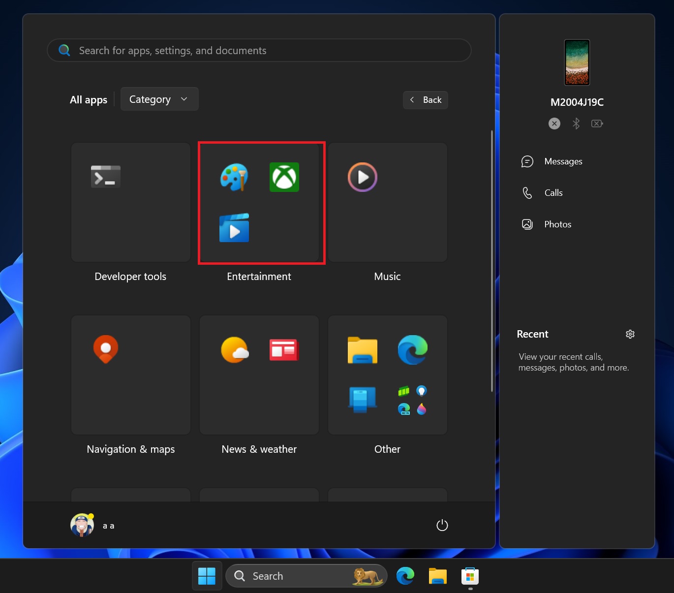
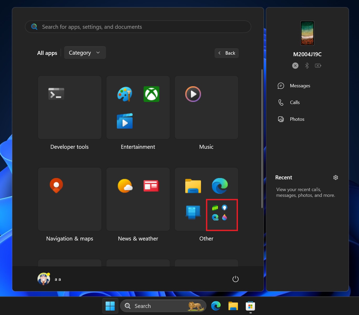
The noticeable change between the last and this build is that some app icons appear in each category box.
The current design can fit four app icons in it. Since it predetermines the apps that go into each box, some are partially filled while others are stacked. Most of these are system/Microsoft apps, and clicking the icon launches the app.

Since this four-app design for each category box is insufficient, the individual box in each category can also act as a sub-category box. In simple terms, clicking on them should show four more apps. However, that doesn’t seem to work in this Beta build.

The design reminds us of live tiles, a feature that isn’t part of Windows 11 anymore. Live tiles could display a notification counter (and even partial notification content). It would be exciting to see if Microsoft implements a counter for apps that need it (like social apps, mail, etc).
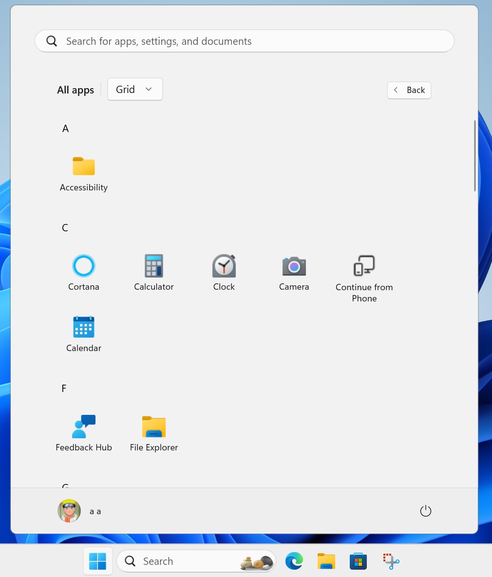
Both the Category and Grid layouts make it easier to navigate the Start menu. The default layout is a waste of space, and you must scroll a lot. The Grid design groups the apps by their first letter, bundling multiple apps under each letter.

We expect the new layouts to become available with the 24H2 update for Windows 11. The same goes for the companion panel for apps that lets you check an app’s stats without opening it.
The post Windows 11’s new Start menu design is a lot like grouped live tiles appeared first on Windows Latest
