Windows 11 Build 22635.3790 (KB5039307) was released a few days back to testers in the beta channel. This comes a new Start menu companion feature for Phone Link, which lets you quickly check phone stats and conversations in the sidebar. However, this update has many hidden settings related to the Taskbar.
Microsoft researcher PhantomOcean3 spotted multiple Taskbar settings quietly added to this build.
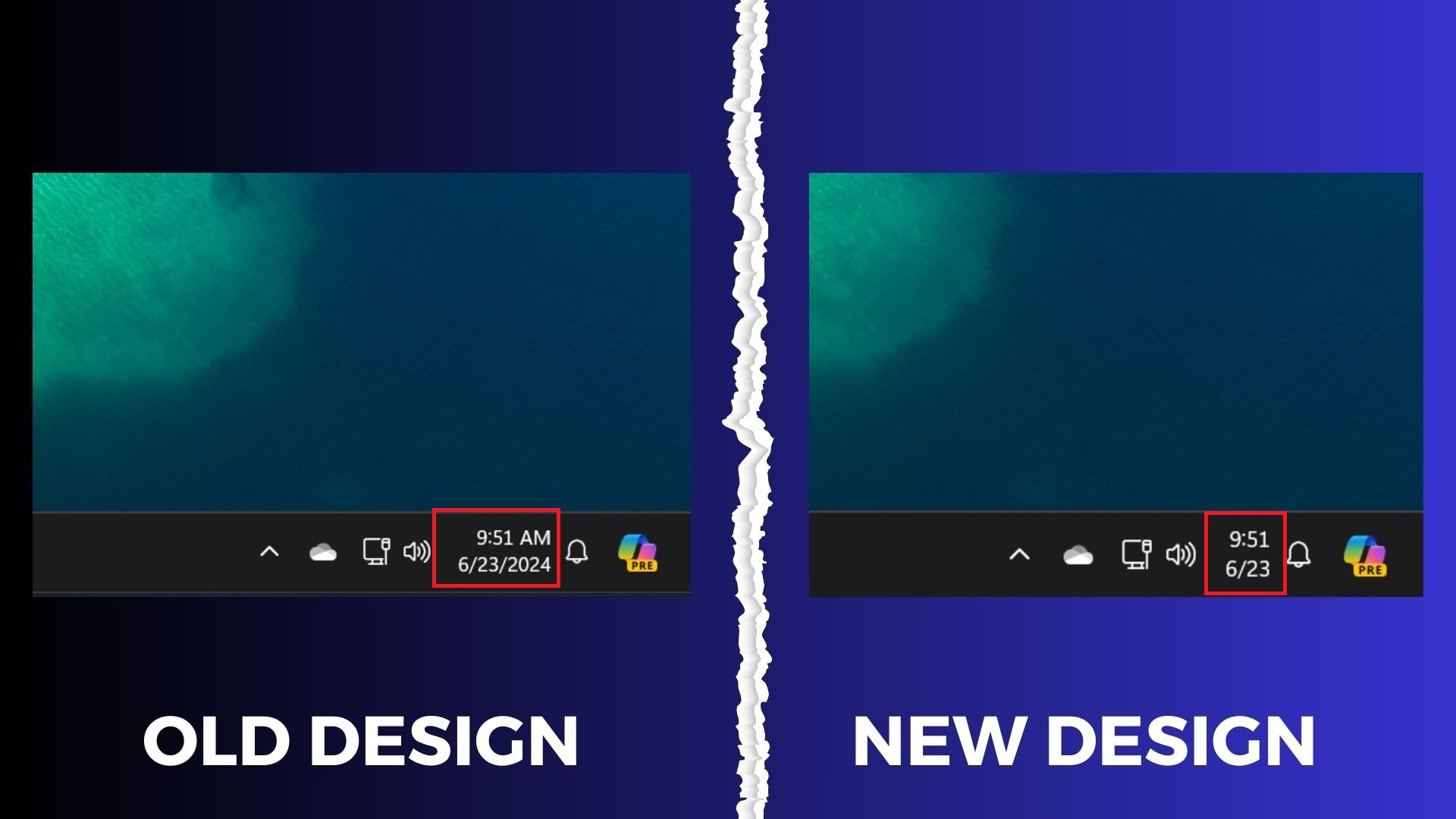
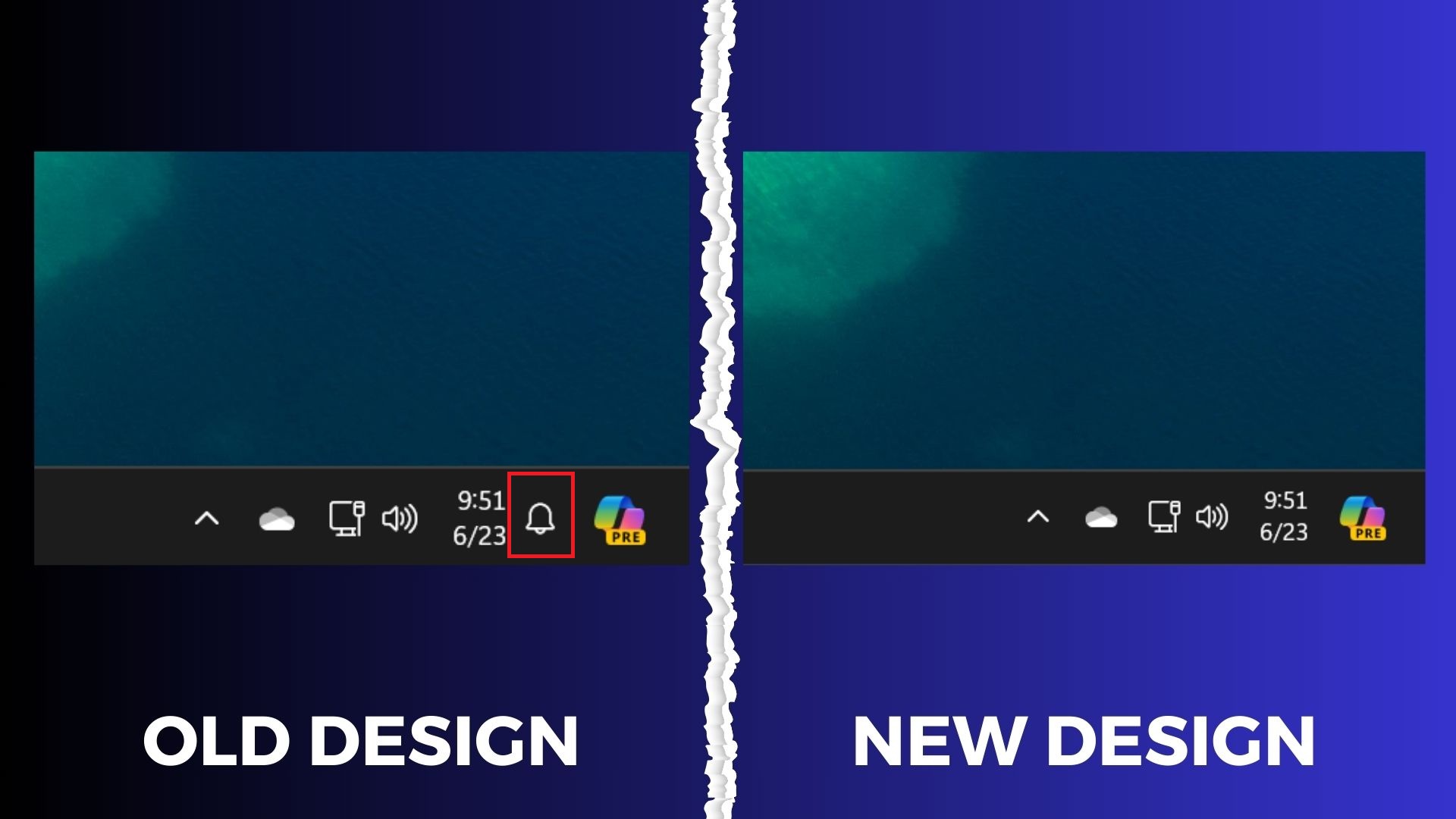
Windows Latest confirmed and tried all the new features coming to the taskbar with Windows 11 KB5039307. As previously reported, Microsoft is testing a new feature to truncate the date/time icon and hide the notification bell on the Taskbar. These changes are now live in the preview build but hidden.
Let’s take a closer at the upcoming taskbar update.
Shortened date/time format in the taskbar
Windows date/time presentation on the Taskbar hasn’t received significant touch-ups. Microsoft added an option to display seconds on the Taskbar, which consumes even more space.
The new hidden setting shortens the area used to display the date/time. Now, it shows the time in the top part (without AM/PM) and only the month and date in the bottom.
Removing the year part almost halves the wasted space. You can pick this layout if you prefer a cleaner presentation.

Open Taskbar settings > Taskbar behaviors and enable the “Show shortened date and time” toggle to try it out in Windows 11 KB5039307.
Show notification bell icon in the taskbar
The notification icon appears alongside the date/time icon. Both of these serve different purposes, and now it is possible to hide the notification bell icon from the system tray.
Open Taskbar settings > Taskbar behaviors and adjust the “Show notification bell icon” toggle to try it out.

This setting gives you more control over what appears in the system tray. You could only hide the date/time icon earlier, but the notification bell remained.
Improved suggestions in App Picker
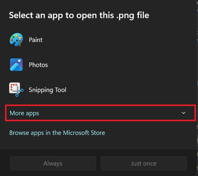
The App picker dialog appears when you select the “choose another app” option in the File Explorer context menu. You can click on any suggested app or browse your PC to find the app.
The current implementation of the App Picker sometimes displays a massive list of apps. But in this Beta build, the App Picker hides most of the suggested apps in a drop-down list.
Clicking on the More apps option reveals the rest of the suggestions, thus retaining the clutter-free look.

Lastly, the Taskbar thumbnails look better and display more information about the active tabs and windows.
All these UI changes are being experimented with and may ship with the upcoming Windows 11 24H2 update this fall.
The post Windows 11 KB5039307 tests new features and clutter-free UI for taskbar appeared first on Windows Latest
