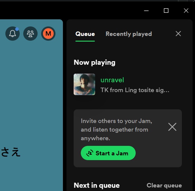
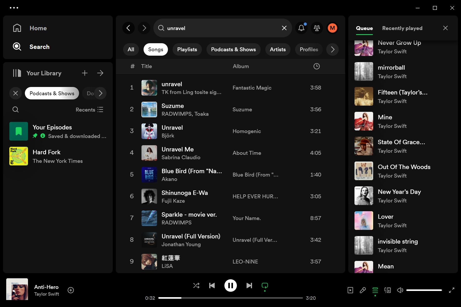
While Spotify has released its much-awaited “Jam” feature on Windows 11 or 10, it has made questionable interface changes. First, Spotify has moved its queue to the right side of the app. It’s locked to the right side, and you can’t open it on the full screen. Second, you can no longer see liked songs, duration, or albums in the new queue design.
I’m not a fan of the new Spotify update for Windows, mostly because I won’t be using the Jam feature. According to the official release notes, Spotify has moved the Queue to the right side, so you can navigate the app and still see what song is coming next, especially if you’re in a Jam.
If you’re jamming, those options pop up at the top of the Queue on the side. You can switch to the Now Playing View or see what your friends are listening to with a quick click. That would be fine for people using Jam, right? But some users including myself dislike how it’s no longer possible to open “Now playing” and Queue together.

In fact, some users are confused about whether this is a design change or a bug, with one user on Reddit noting: “The queue is showing up on the sidebar where I almost always have view on (I like being able to see the info sometimes, so I leave it on). It wasn’t doing that earlier when I was using Spotify. I’ve tried to restart everything, and it’s still happening.”

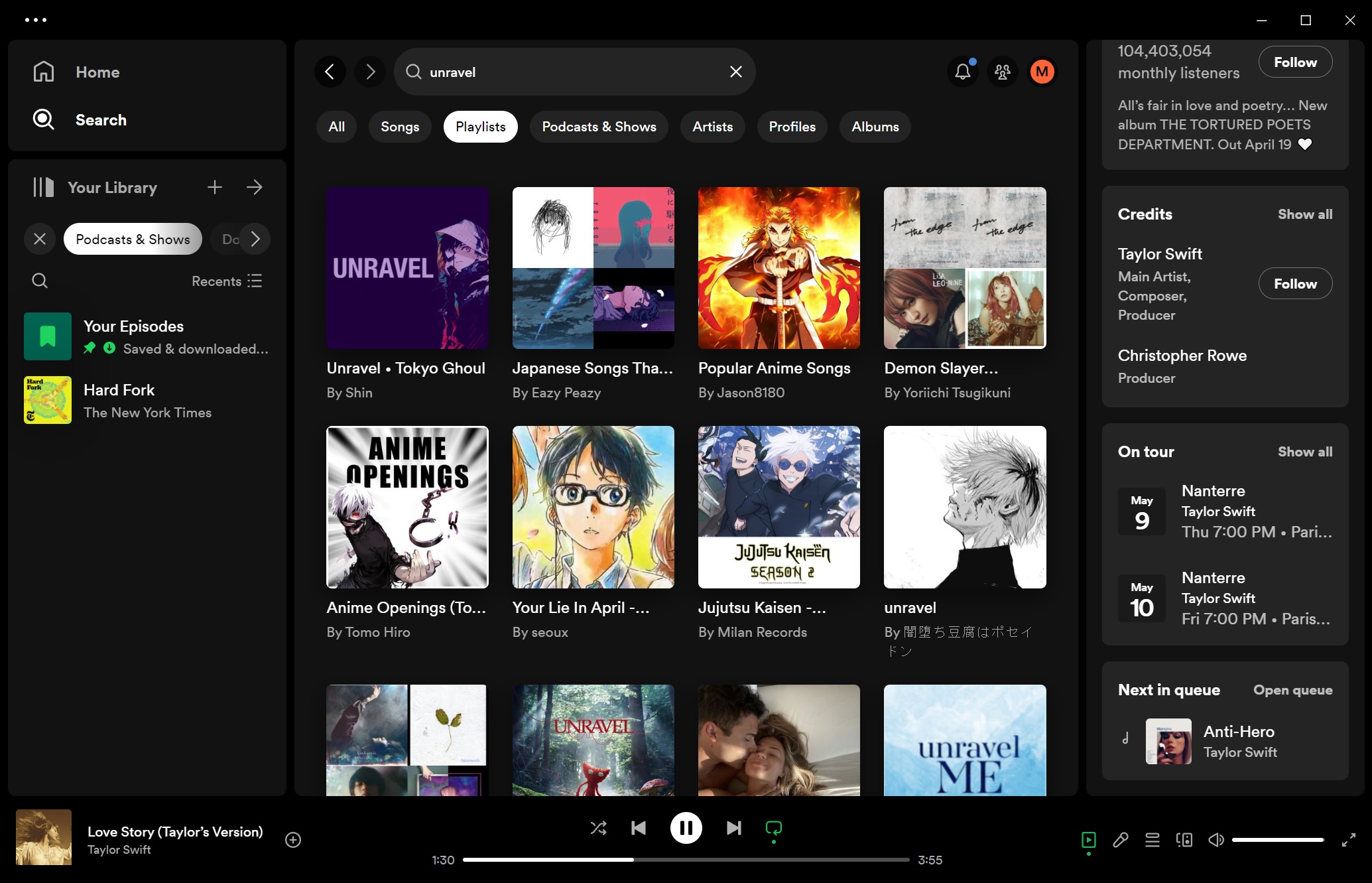
After the update, the app will always show the homepage, and the right sidebar is now used to switch between what’s playing and the Queue.

You can still hover over the playing song and click “Expand”, but it will open “now playing” on the right side in a limited view and hide most of the queued songs. If you want to see all your queued songs, you can expand the queue, which collapses the current playing song.
As shown in the above screenshot, you can no longer see track length in the queue sidebar. The album name and liked songs are also missing.
Users dislike Spotify queue changes, limited now playing on Windows
As I noted on X (Twitter), Windows 11 has a great full-fledged native app for Apple Music. On the other hand, Spotify seems to be struggling with its web wrapper design choices.
The updated Windows 11 app wants you to keep looking at the home page whether you like it or not, and it’s no longer possible to keep a detailed track of the upcoming music playlist with now playing open.
“I know Spotify loves to change the UI every couple of months but I really am getting frustrated with the cluttered experience. I used to love full sized album art before the ‘now playing’ view, and then I at least enjoyed having the queue displayed as the main screen. But now both are changed,” another frustrated user wrote in a post to Spotify community forum.
“I don’t want to see what I *could* play, once I have chosen a playlist, I want to see what *will* play. Or at least have the option to full-screen it,” they added.
Spotify says this change is supposed to help us browse while still keeping an eye on what’s next or if we’re in a Jam. That’s great, but I won’t use the Jam feature regularly.
The multi-billion dollar company is known for making controversial design choices. In April 2023, Spotify replaced its desktop app with a web wrapper to cut costs and become a cross-platform service.
The post Spotify on Windows 11 gets Jam, and moves queue to the right side appeared first on Windows Latest
