Earlier this year, I confirmed that Microsoft is redesigning File Explorer. My sources told me this would be the biggest redesign since Windows 8. While the interface is not changing dramatically, Microsoft is integrating Microsoft 365 into Windows 11, adding drag-and-drop support to tabs, introducing a new header menu, recommended feed, and more
Our reporting was based on internal documents I saw and references in Windows 11 preview builds. While Microsoft never confirmed it was working on a new File Explorer experience, the tech giant suggested a big ‘refresh’ is coming in a Windows Insider webcast where the company said it is moving File Explorer to WinAppSDK to unlock new APIs.
At Build 2023 developer conference, Microsoft finally teased the all-new modern File Explorer refresh. It’s unclear when the update is coming out, but we have accessed an early and unreleased version of the new File Explorer that mirrors what was teased at the conference.
Before we take a closer look at the new File Explorer, here’s the expected changelog of the update:
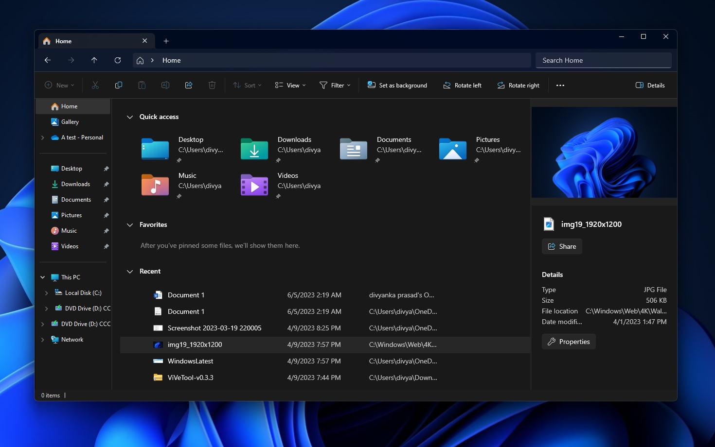
- A new header with modern controls, a modern search bar and a home button.
- The search bar is now faster than ever.
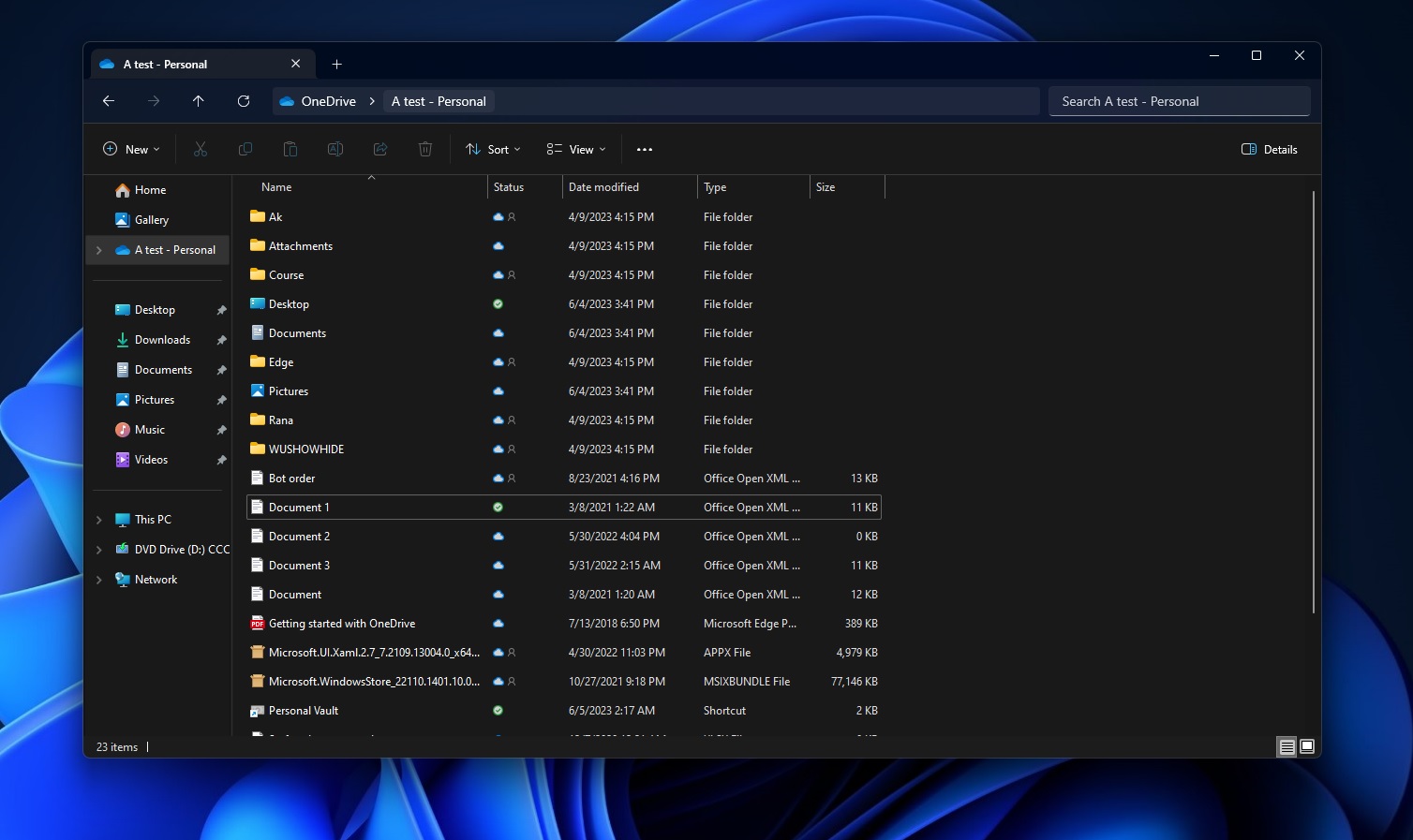
- Microsoft 365 is integrated into File Explorer, and you will see 365 content in File Explorer.
- The sidebar has been updated with a new details pane.
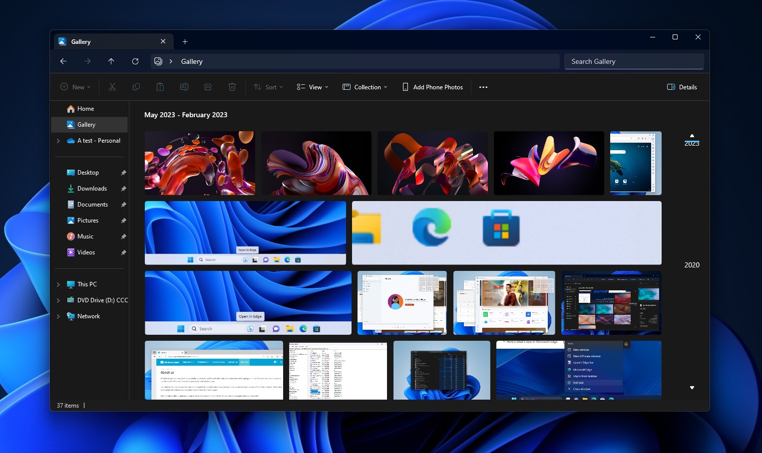
- A new Gallery View for an enhanced Microsoft Photos app-like experience.
- WinUI 3 and more web controls via XAML.
New details pane, header design

File Explorer is not changing dramatically, but many new interfaces are worth checking out.
For instance, the details pane has been updated with a modern interface that matches the Windows 11 aesthetic. It displays recent activity and provides quick sharing options, enhancing usability.
However, the properties dialog remains starkly white, awaiting a dark mode update.
The File Explorer interface now resembles a web browser more closely, echoing the design from the Windows XP and Vista days. The top of the interface features the address bar, back and forward buttons, an ‘up’ button, a refresh button, and a search box.

The File Explorer commands are below the address bar, reversing the previous layout change introduced with Windows 11 Moment 2. This repositioning is part of a broader effort to align File Explorer’s interface more closely with the Windows 11 design ethos.
The navigation bar on the left and the settings page are due for substantial updates. The updated File Explorer incorporates modern Mica blur effects and drop-down menus for seamless directory navigation.

An exciting upcoming feature is the ability to drag and drop tabs outside and inside the File Explorer window. For example, you can select and drag a tap into its own window and drag it back into the primary window.
New Gallery View
A new Gallery feature is coming to Windows 11, showing content from directories like Pictures. This is similar to the Microsoft Photos app’s Gallery, optimized for most recently taken photos.

You can also view photos directly from your mobile device, thanks to a new button in the Command Bar that lets you add photo photos.
The redesigned File Explorer in Windows 11 promises a more intuitive, streamlined, and aesthetically pleasing user experience. It should begin rolling out to the general public with Windows 11 23H2, which is set to arrive in the fall of 2023.
The post Windows 11’s redesigned File Explorer leaks online, here’s our closer look appeared first on Windows Latest
